Apple iPhone 6S
When I showed the iPhone 6S to one of my wife’s friends, she got nostalgic. She waxed emotional about its predecessor, the iPhone 6 . It changed her life. Bigger screen, better camera, and Apple Pay. Everyone wanted these things. It was as close to a perfect phone as I’ve ever seen. All it ever really lacked was a better battery (Plus notwithstanding).
I showed her 3D Touch, Apple’s newest technology on these iPhones. She pressed on the hypnotically-animated lock screen, a swimming fish. She watched it dance under her finger. And yes, she was impressed. But when I showed her everything else 3D Touch does, she said, “I’m not sure I’d really use this.”
This year’s follow-up iPhone, the iPhone 6S, doesn’t improve on that battery. And its newest features aren’t as instantly game-changing, at least not on the surface. That’s obvious: it’s an S-year iPhone, and Apple always uses these subtle every-other-year S upgrades to tweak design and ramp up processor speeds. It’s the phone for people who didn’t get the iPhone 6 last year. And for the past few years, S phones have introduced evolutionary changes that seriously evolved the phone; the iPhone 4S added Siri, and the iPhone 5S debuted the Touch ID fingerprint sensor.
The new iPhone 6S and 6S Plus look the same (except for the metallic-pink rose gold model) as last year’s iPhones. In a lot of ways they also feel the same. But there are hidden advantages at play. The newest, boldest tech is a new pressure-sensitive touchscreen technology called 3D Touch. There are lots of other improvements, too: better cameras. Better overall system speed. And always-on (and I mean always-on — unless you turn it off) Siri. And, something I didn’t even get a chance to test fully: a completely redesigned construction with a reinforced glass screen, which Apple promises is sturdier all-around. We’ll get to that in the next few weeks, but that alone could make a difference for a lot of would-be buyers.
3D Touch might be the “Next Big Idea” in touchscreens and interfaces. But does it make these new iPhones must-haves for that reason alone? I think it will, down the road, when more apps are here. But right now, its software advantages are subtle.
I spent a week with the iPhone 6S and 6S Plus (in rose gold and gold, respectively), taking them everywhere I went, from farmer’s markets in New Jersey to tailgating at a New York Jets game, to commuting on New Jersey Transit through the Meadowlands and to my kid’s meet-the-teacher night. I showed them to my friends, my family, anyone I met and got their opinions, too. (For on-the-fly impressions, check out my weekend diary.)
I might take the miracle of tiny, powerful smartphones for granted, but I can’t shake the feeling that the iPhone 6S doesn’t, at this moment, have the “one big thing” to make people want to upgrade from the 6. That doesn’t mean it’s not a better phone, of course it is. Right now, however, it’s a promising upgrade from the iPhone 6, not a revolution.
But if you’ve been holding off on getting an iPhone for a while, don’t wait anymore. Get this one (or its big-screen sibling, the 6S Plus). Just make sure you don’t buy the 16GB model.
3D Touch: Amazing hardware needs killer software
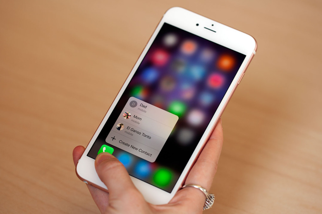
Press in on the iPhone 6S screen and new fascinating things happen. A pop-out window emerges. Little menus appear. You feel a buzz, or a light click. Much like the Apple Watch , these iPhones let you push in on the screen to accomplish small tasks. Apple calls this 3D Touch. And it’s the boldest new tech on these iPhones by a mile.
It’s a cool idea, but as I’ve discovered showing it to my family and friends, it’s not entirely intuitive at first. Yes, its promises could be vast. But 3D Touch ends up being used very tentatively in the iPhone 6S and 6S Plus software at the current moment: it mostly adds either pop-up “quick action” menus from apps on the home screen, or adds “peek” and “pop” to apps, expanding links or messages into previews that you can then open up fully, or tuck back away by lifting your finger. Some apps do a lot with these new ideas, especially Mail.
Peeking-and-filing emails can transform how that app is used. But a lot of people who try it for the first time don’t realize how to take advantage of 3D Touch. There’s no tutorial. And for the most part, 3D Touch isn’t essential yet. Until it starts to be incorporated into more apps — and in a more useful fashion — I wouldn’t be surprised if a lot of people forget that it even exists.
I like using 3D Touch to preview links, or to pop-up related apps. When I hold an app and see a menu of extra options under my thumb, it feels almost like a computer, not a phone (the latest MacBooks, which utilize a similar but less sensor-studded trackpad technology Apple calls Force Touch, have pop-up previews in Safari, too). Apple’s building a common language, and evolving what your phone-sized computer can do.
Pop-out previews are a really clever idea; links within Safari preview Web pages without any actual clicks. The ability to pull up menus in the iPhone almost feels like right-clicking on a computer and getting a contextual menu. It’s helpful, and surprisingly utilitarian. But you don’t need to use it, you can always do things the same old way as always, with regular touch controls. You can even turn 3D Touch off. And, those menus that pop up don’t offer all the options I’d want. They’re not all that customizable, either: what 3D Touch does, or doesn’t, do is mostly up to app developers. A good handful of apps have emerged to take advantage of 3D Touch, but it’s going to take a while before it feels widespread.
Maybe that’s why 3D Touch doesn’t feel essential yet in iOS. But the apps that are emerging to take advantage of it are slowly coming, and those could get really interesting. Imagine pressure-sensitive music apps. Art apps. Games. Remotes — controlling a drone with 3D Touch toggles to gently control directions, for instance. You could press down to change brush strokes when painting (the new Notes app already allows this). You could press down harder on virtual piano keys (Smule’s Magic Piano app added this function already). Racing games can get analog gas pedals (AG Racer added this, and it’s one of the best demonstrations of 3D Touch). I could see it working as a virtual dimmer for smart home remotes.
I want more. I’ve started 3D touching every icon, every menu; I want 3D Touch in all my apps, everywhere. It’s weird when it isn’t. I want smarter 3D Touch menus, smarter extra features. It’s legitimately better to have it than not have it, but I don’t expect its killer apps to emerge for at least a couple of months. And iOS could use splashier ways of taking advantage of it, too, like that animated lock screen. What if I could push through folders, or push-to-magnify, dipping in and out of views?
It’s not a really matter of whether 3D Touch is worth upgrading to now. You’ll upgrade to it sooner or later. Your phone will eventually have it. Do you want it later, or now? Down the road this is going to enable major, major changes in how iPhones and iOS work. Right now, it’s a subtle thing.
What my family and friends thought
Most of my friends and family didn’t necessarily care about the iPhone’s new features. My wife is long overdue for an upgrade from the iPhone 4S, but she didn’t care about 3D Touch. Or Live Photos, for that matter. She’s considering buying an iPhone 6. My brother-in-law just wanted Live Photos to help him go back and pick better photos, like Burst Mode. My mom already has an iPhone 6, and other than needing more storage for her photos she didn’t see anything new she needed, either. My kids thought Live Photos were cool, but didn’t recognize the difference between those and videos (down the road, I think that’ll be true for most people, and that’s probably the point).
What I think
If I were to buy a new phone now and didn’t get an iPhone 6, I’d buy this, easily. In 64GB or 128GB — never a 16GB (those smaller sizes barely hold enough photos and videos to get by if you’re the type of person who doesn’t delete). If I had an iPhone 6, I’d wait until next year…or, find a way to sell my phone and trade up without it costing me quite so much.
I think Apple, and the whole phone industry, are trying to change the “Should I upgrade?” question bit by bit. They’re trying to make it an “every year” thing, not an “every two years” or “Should I buy something new?” thing. Phone plans like AT&T Next, or Apple’s own yearly plan, are almost like leases. You can trade in your old ride and seamlessly move to a new one.
The 6S fits that model well; it’s enhanced and improved. Is it shockingly new or a vault forward? No…except for the concept of 3D Touch, which is brilliant hardware still in need of software which will make it truly shine. That software, from iOS itself and apps, will come, but maybe not right away. 3D Touch could build a new style of touchscreen app design, bleeding into iPads, the Apple Watch and maybe influencing the rest of the industry. Right now, just a week in, it’s still baby steps.
This iPhone is built for the future, but in the present it’s mostly a nicely improved iPhone 6.
A deeper look at the iPhone 6S
As we said, 3D Touch isn’t the only thing that’s new on the iPhone 6S. Here are more in-depth looks at the camera improvements, and the speedier internal processor and fingerprint sensor. Also, a look at how Apple’s smaller 4.7-inch iPhone model differs from its larger sibling, the 5.5-inch iPhone 6S Plus (it’s a bigger difference than last year). And finally, thanks to the major changes in how phones are sold (in the US, at least), we look at how the buying — or leasing — calculations change the purchase decision on these new iPhones, too.
The improved camera: Live Photos, 4K video recording and more
What do Live Photos do? Apple’s new camera innovation records a second and a half before, and a second and a half after you snap any shot on your phone, with front or rear cameras. I took a bunch of photos, and then forgot about it. Later on, I realized that all my photos had bits of video and audio attached. Press down, and I could see the photos become little videos, of sorts. Or animated GIFs with audio.
They don’t look like normal videos, exactly: they’re more like time lapses. The images skip a bit, like a flipbook. It has a bit of a magical, distancing feel. These end up seeming like little mementos.
Editor review
4
GoodSummary
Improved speed everywhere (new processor, faster wireless, quicker Touch ID sensor); a sturdier body; better front and rear cameras; a bold new 3D Touch pressure-sensitive display that could end up being a really useful tool in apps down the road, and which already offers new iOS shortcuts.
You might also like
Oppo F1
The OPPO F1 houses an 8-megapixel front facing camera with a wide f/2.0 aperture lens and a sensor size of ¼ inches. This allows for more light to enter the
Samsung Galaxy S6 Review
Curved things are inherently visual; parsing the subtleties of a surface that flows and disappears into something else is pleasing to the eye, and to the touch. The Galaxy S6 edge (yes,
Moto G4 Plus review: From budget to mid-range
Moto G phones are not exciting. They’re not sexy and they’re not powerhouses. But they get the job done, and do it for a reasonable price. Since the line’s launch


0 Comments
No Comments Yet!
You can be first to comment this post!