Samsung Galaxy S6 Review
Curved things are inherently visual; parsing the subtleties of a surface that flows and disappears into something else is pleasing to the eye, and to the touch.
The Galaxy S6 edge (yes, lowercase “edge”) is the second device in Samsung’s latest smartphone unveiling, arriving at the same time as its S6 counterpart for $100 more across the three storage sizes, 32GB, 64GB and 128GB.
While not a huge departure from the core design fundamentals of the regular S6, the edge has enough differences to warrant a separate look, and a separate recommendation. On the other hand, it is so similar that, unlike the Galaxy Note Edge to the Galaxy Note 4, users shouldn’t feel immediately compelled to consider the S6 edge unless those curves are immediately captivating.
For this review, I caught my three-month future self on a warm June day just as he was about to sit down for a few drinks with some friends. Questions from present me are in bold, answers by future me are in plain text.
Hey Daniel, what’s the future like? Is it warm?
Hey Daniel, it’s nice to chat with you. Sorry about that thing in early May.
Wh–what thing?
Nothing, never mind.
Okay… So, you’ve been using Samsung’s newest smartphones for a few months now. How are they holding up?
I’ve had them for three or so months now — hang on, just have to order another beer *incomprehensible background noise* — and they’re holding up pretty well.
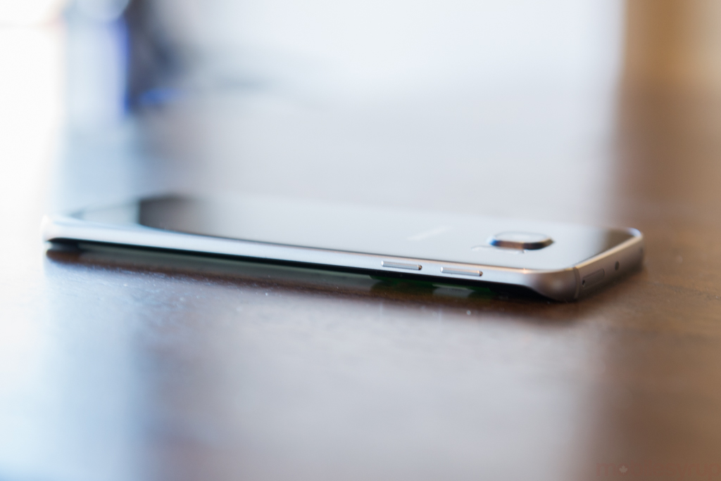
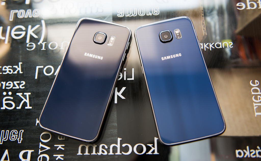
Like most glass smartphones, there are a bunch of small scratches, both on the front and back of the device. I have a feeling that, like Apple did when transitioning from the iPhone 4s to the iPhone 5, it will likely switch to a different rear material for Galaxy S7 — or whatever it ends up being called.
But you like them — you’re still using them?
You know, a lot of Android phones come out every year, and so few are memorable. These phones, though — they’re keepers.
What are the main differences between the Galaxy S6 and the S6 edge?
Well, Daniel, that’s a great question. Unlike, say, the iPhone 6 Plus, which is also $100 more than the regular iPhone 6, the Galaxy S6 edge has the same screen size, resolution, internal components and general design.
The dual curved edges, and the functionality they provide, is solely what separates the S6 from the S6 edge. That and a slightly larger 2,600mAh battery over the regular S6’s 2,550mAh cell.
Both devices run Android 5.0.2 with Samsung’s quirky TouchWIZ skin, which is in myriad ways improved over previous versions, but is still infuriating in some obvious ways.
You talk funny. Tell me more about these edges – why are they so interesting?
To do that, let’s go back a few years. Back in 2012, Samsung unveiled a new flexible display technology called Youm, the basis for smartphones that would be rollable like a piece of fabric. But after showing off a prototype, it quickly became apparent that the difficulty in bringing this technology to market wouldn’t be around the display itself but the glass that covers it. It is extremely hard to successfully curve glass without sacrificing its integrity.
We didn’t hear a lot about this technology combo for a long time, but in September of 2014, Samsung unveiled the Galaxy Note Edge, a variant of its Note 4 phablet with a curved edge on the right hand side.
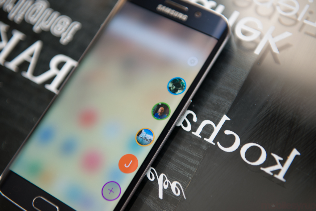
This edge was a completely separate area of the phone, acting as both an alternative to the notification area at the top of the display, and a way to convey short bursts of information — news alerts, stock information — without distracting from the main screen.
As we said at the time, the Note Edge was a beautiful experiment, but little more. Not only was Samsung reticent to produce a lot of them — ostensibly, production of the curved glass that covered the AMOLED panel was expensive, time-consuming and not entirely reliable — but they also admitted that it was more an experiment than a fully-blown product line.
Skip to March 1st and the unveiling of the Galaxy S6. Samsung, by pairing the main S6 with its curved counterpart, has thrust “the edge” into the mainstream. And by charging $100 more for it, Samsung has formalized the pricing hierarchy that began with the Note Edge in the fall.
You still haven’t mentioned why the Galaxy S6 edge itself is so interesting…
Wow, impatient much? I’m getting there.
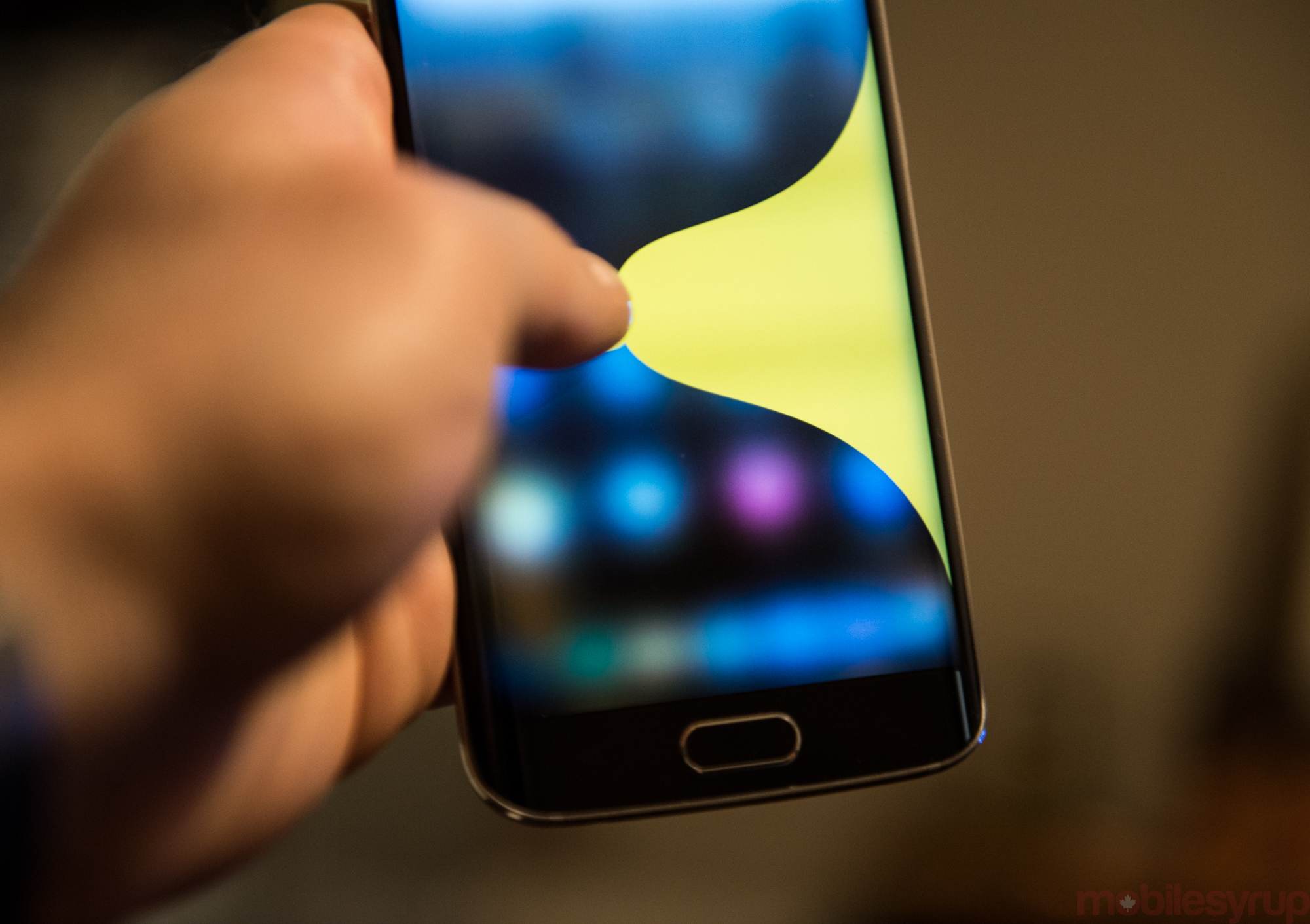
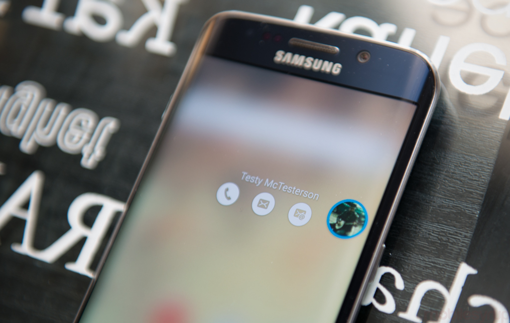
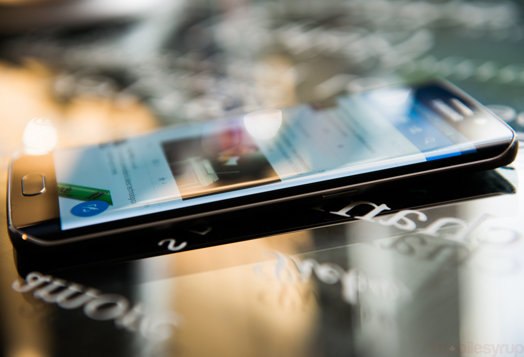
The extra real estate adds only a moderate amount of functionality; users can set up to five contacts to quickly call or message by swiping in from the side of the screen; and it works as a night clock when the display is off. You can count on one hand the number of tangible features the edges add to the core S6 experience.
The edge is interesting because it produces something of an aspirational “premium” Galaxy S6 without undermining the Note series, which has its own two-tier lineup. While some pundits have said that the S6 edge should have been the only Galaxy released in April, Samsung has created a differentiator between its premium devices and those of its competitors, without undermining the core value proposition of its main Galaxy S6.
If the Galaxy S6 differed in other major ways from the S6 edge — in, say, camera quality or battery life — I may be more inclined to recommend it, but as it stands the curve is merely interesting from an aesthetic perspective.
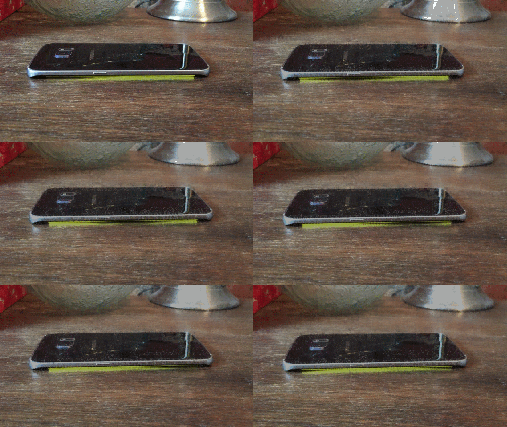
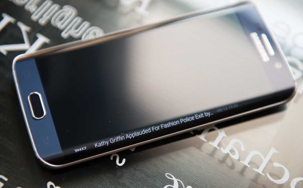
What about that cool feature where the phone pulses a certain colour when someone calls?
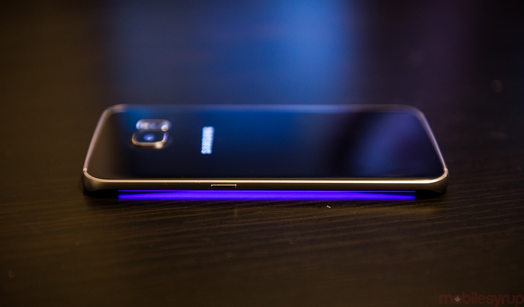
Right, that’s the big edge showstopper, the demo feature that everyone will “ooh” and “ahh” over, but in my three months with the device I can count on one hand the number of times I’ve actually used it, namely because I never place the phone on its face.
Because that could scratch the display.
Sure. But more than that, it’s an acknowledgement of a behavioural change that I fundamentally disagree with. Samsung is encouraging people to take their phones out of their pockets, place them on a table upside down and hope that the lighting is such that the assigned colour will shine through.
Not only does the feature not work on outdoor tables, but being able to see who’s calling by assigning them a colour is a solution to a problem no one has.
Now that summer’s here, I’ve been spending a lot of time outdoors. I’ve noticed that while some people do place their phones on a table, say on a patio table, few place their phones face down.
Are you using any of the other edge-specific features, like the Information Stream or Night clock?
There aren’t a lot of useful apps specifically designed for the edge display, largely because they’re only accessible when the display is off.
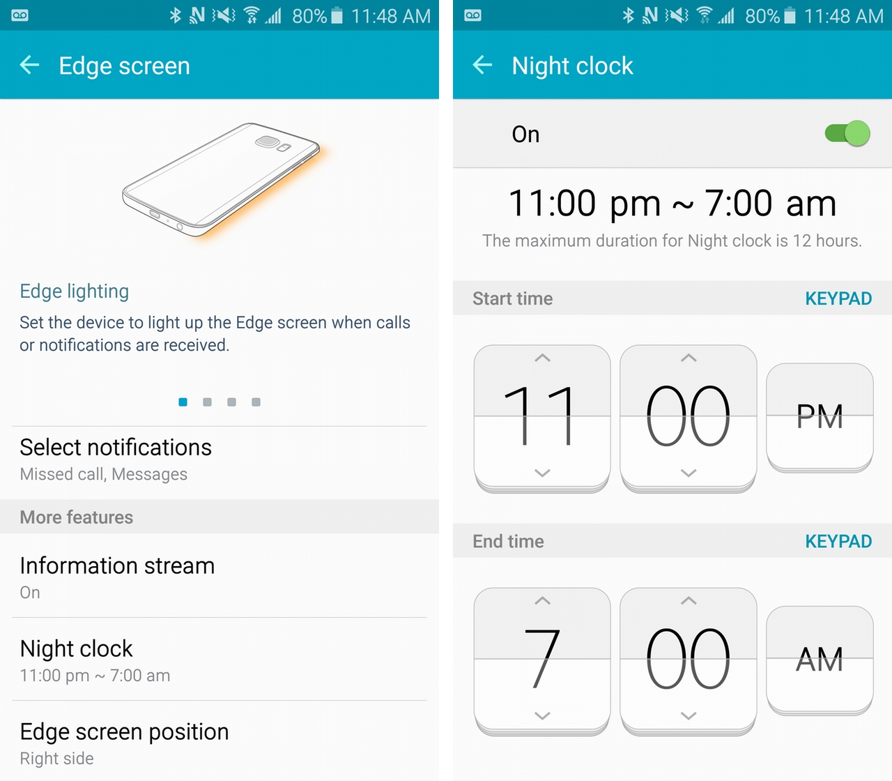
Samsung’s partnership with Yahoo means that you can swipe between news, sports and stock updates, but the low density of information makes such an implementation almost useless. Eventually, with an SDK, these experiences could improve, but developers haven’t been falling over themselves. The fact that you need to vigorously rub your finger along one of the edges just to enable the feature speaks to how little thought went into the use case.
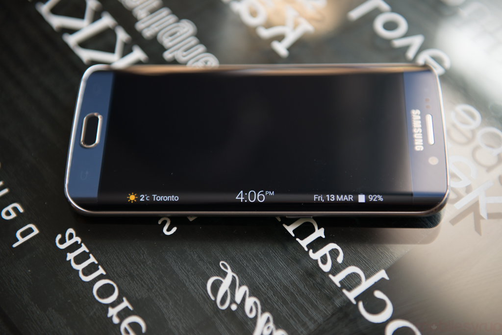
I will admit that I do love the night clock; when paired with a wireless charging pad next to my bed, the screen shines softly with the time and next alarm. Give me more of this, please.
What about holding the device? Does the curved display make it more difficult to grip?
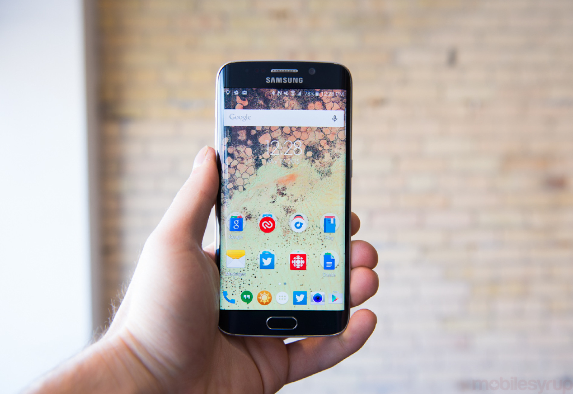
Actually, yes. While the curved edges make the phone appear narrower in the hand, even though its dimensions are nearly identical to the mainline S6, the reduced bezel space has the side effect of making the S6 edge feel more precarious in the hand. It’s also considerably more difficult to pick up from a table.
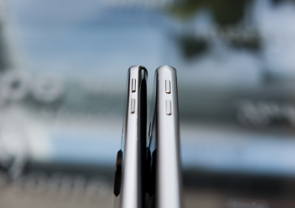
Samsung was wise to keep enough room on the metal sides for the volume and power buttons — which are on the left and right sides, respectively —
Stop talking like you’re writing.
Shut up.
Anyway, at the end of the day, the S6 edge feels amazing to hold in the hand, but after months of daily use, I’d recommend the regular S6 over it, both for practical and price reasons.
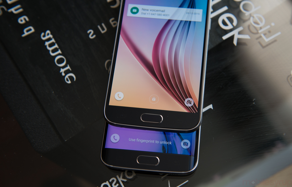
Seriously, though, I’ve heard that the curved edges affects the way some apps respond to touch. Is this an issue?
Yes and no. Aesthetically, the edges ever-so-slightly distort part of the content when viewed at an angle, as a convex surface does. It’s not ubiquitous, and can actually be mistaken for a ray of errant light falling on the panel, but it is there.
Functionally, the edges make it more enjoyable to swipe in from either side; the issue is that, occasionally, your hand, especially if you’re left-handed, will accidentally activate part of the screen. Many modern Android apps rely on the left-side swipe, and the edge doesn’t have any palm detection, so it will mistakenly assume a touch when it was merely a hold.
Some, ahem, edge cases, where swiping in from the side requires a more precise action, do not function well here, and will need to be updated to explicitly support the edge display. The question is whether developers are going to invest in this expensive device just to make sure their apps perform optimally for a very small number of individuals.
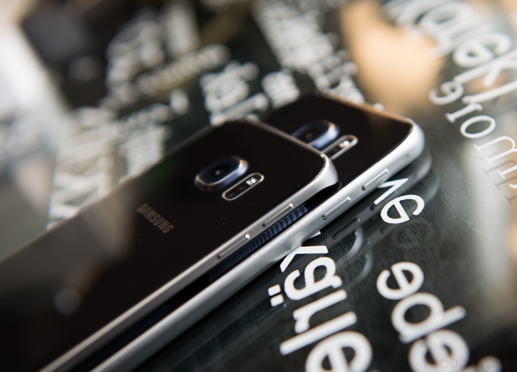
Let’s talk about the price for a second. The S6 edge is $100 more than the already-expensive Galaxy S6. Do you think it’s a worthwhile investment?
For the hardcore enthusiasts who want the latest and greatest in design, I absolutely do. Samsung has developed a phone that people will want to show off; it’s as close to a showpiece as you’re going to find on the smartphone market today. This is a huge departure for Samsung, and a welcome change to the industry. Samsung was always considered this giant monolith that created all of its components but designed phones by committee.
I don’t even mind that the phone doesn’t have waterproofing anymore. Samsung’s basically saying, You want a waterproof phone? That’s niche — get an Active.
At $350 on contract, the S6 edge is not cheap, but it’s being introduced at the same price point as the entry-level iPhone 6, which should bode well for Samsung when customers compare the two side-by-side.
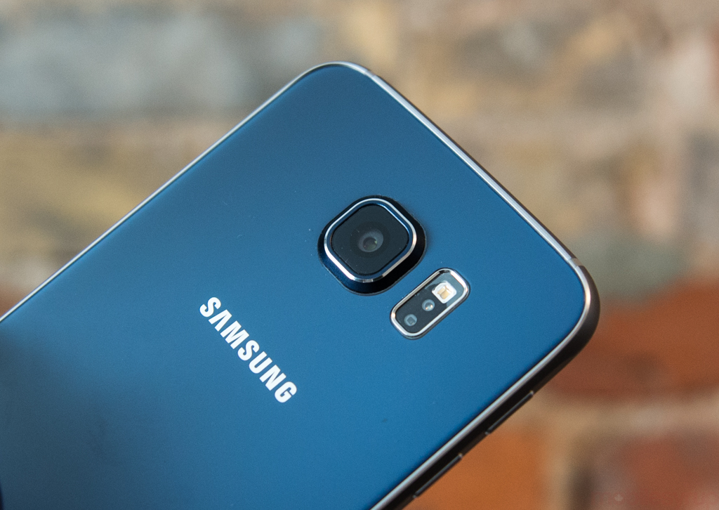
How’s the camera? In my review of the S6, I found the phone to take amazing daylight shots, but the low-light quality was lacking.
You know, this is what I keep coming back to. The Galaxy S6 edge takes incredible photos in most lighting conditions, but by virtue of its densely pixellated sensor it doesn’t keep up with some of the other devices in low-light. A trick I found for getting around that limitation is using HDR, which takes multiple photos quickly with different exposures. If moving objects aren’t an issue, you’re likely to get some great shots in any lighting with HDR turned on.
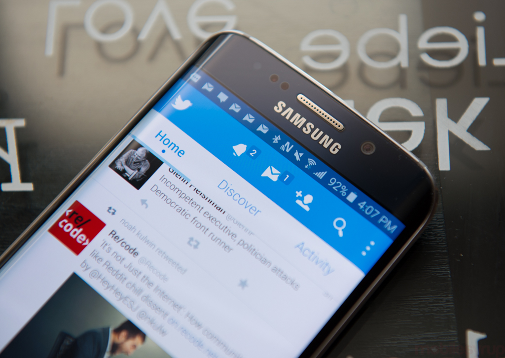
What about battery life? I didn’t have the greatest experience when I reviewed the S6.
Yeah, battery life is a weird one. Some days I have amazing battery life and others it’s dreadful. I think it comes down to what you’re doing on your phone.
You also have to remember that you reviewed the S6 with pre-release software, which didn’t do you any favours; my phone received (at least) one OTA update to clear up bugs, and it’s running a lot smoother as a result. Battery life isn’t great, mind you, but I don’t miss the removable battery; being able to top it up quickly using Fast Charge is still preferable to having a thicker phone with seams running all around it.
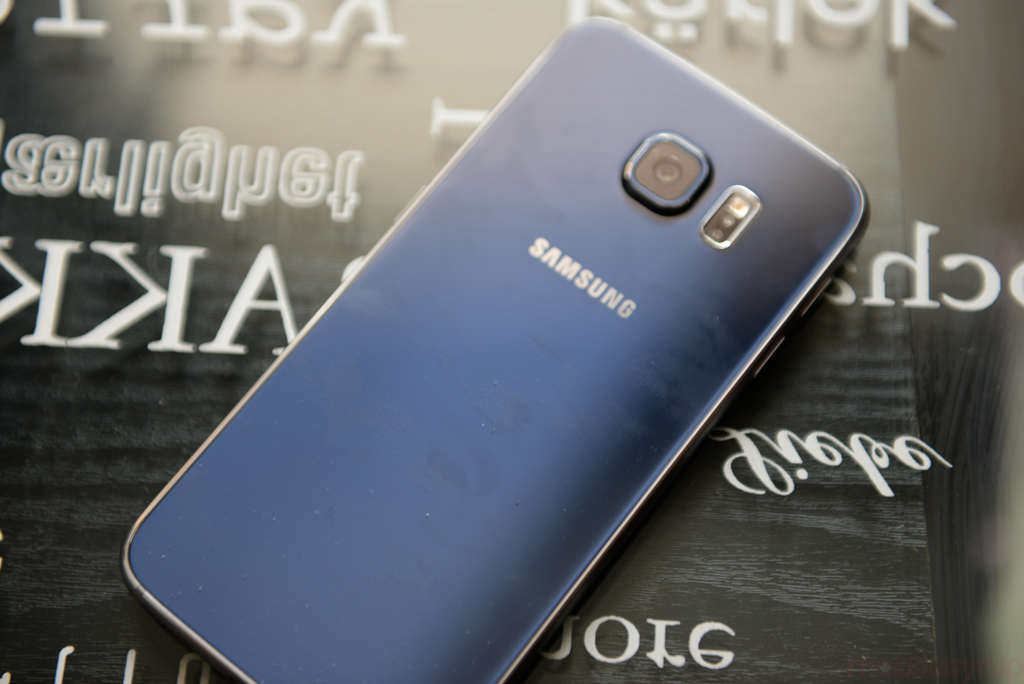
So you think Samsung made the right decision in sealing up the rear case.
Other than the fingerprint-sensitive glass, I do. I’ve spoken to a lot of hardcore Galaxy fans over the past few months, and even they, once they looked at the phone, understand the design advantages of these devices. They’re just beautiful. The edge especially so. The removal of the microSD slot is a bit more controversial, since I don’t think its presence would in any way hinder the functionality of the device, but the move is a clear acknowledgement that Apple’s model of hierarchical pricing based on storage is working.
From a distribution perspective, Samsung now has nearly as many in-store SKUs as Apple does, especially since it still sells the Galaxy S4, S5, Note 3, Note 4, Note Edge and a bunch of lower-tier devices. Because Samsung lacks Apple’s standalone retail presence, it must use carrier stores to showcase its dominance. Not only will the S6 edge get more people in stores, admiring it for aesthetic reasons, but having two models at a variety of price points makes it easier for customers to justify buying one, since the differential between the cheapest S6 and the most expensive S6 edge is significant.
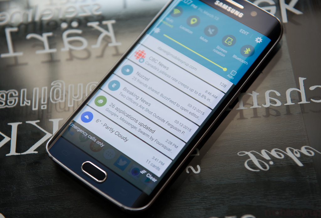
What about TouchWIZ? Does it still get on your nerves?
The first thing I did after setting up the Galaxy S6 edge was to install a custom launcher. Samsung’s improved a lot of things, but its launcher is still a mess.
In other areas, though, the software is remarkably improved. For the first time using a Samsung smartphone I didn’t feel the need to install third-party alternatives to the calendar and gallery apps. Even the keyboard is better… though I switched to SwiftKey because it’s my jam.
I really think that Samsung finally got this whole hardware/software marriage as right as it could given the fact that it doesn’t build its own operating system. Android 5.0.2 is really fast, even when using two apps with Multi Window — which I actually find useful on this QHD screen.
*muffled shouts from the distance*
It sounds like things are getting a bit raucous over there. Sum things up for me before you go.
Yeah, the Raptors are playing in the NBA Finals so everyone’s pretty excited.
Basically, you can’t go wrong with either the Galaxy S6 or the S6 edge. I’d go with the plain S6 because it feels better in the hand, is cheaper and has no major downsides. The S6 edge arguably looks better, but the software features that take advantage of the curves feel tacked on.
Both phones are pretty much the best Android devices currently available, especially if you’re a camera buff.
Disclaimers: We do not own the content and images for this review
Original Source: http://mobilesyrup.com/2015/04/01/samsung-galaxy-s6-edge-review/
You might also like
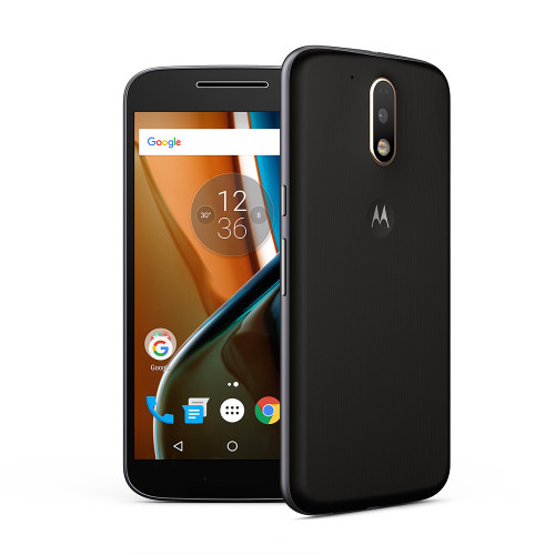
Moto G4 Plus review: From budget to mid-range
Moto G phones are not exciting. They’re not sexy and they’re not powerhouses. But they get the job done, and do it for a reasonable price. Since the line’s launch
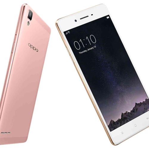
Oppo F1
The OPPO F1 houses an 8-megapixel front facing camera with a wide f/2.0 aperture lens and a sensor size of ¼ inches. This allows for more light to enter the
Cellular BOOST and Essential OMEGAS Review – Unlocking Optimal Pet Health
Are you searching for the perfect combination of supplements to enhance your pet’s health and well-being? Look no further than Cellular BOOST and Essential OMEGAS. These two exceptional products are



0 Comments
No Comments Yet!
You can be first to comment this post!